Responsive!
Is your site responsive and ready for visitors on mobile, tablet and desktop browsers alike? Do you need to show content that is more relevant for someone viewing your site on a mobile device? Do you recognize the importance of reducing what is shown to visitors on smaller devices so they view what’s really important?
Widgets Control Pro allows you to use display conditions that help to adapt the looks of your site depending on the screen size of the device that the visitor uses to browse your site. This is an important tool in improving the user experience for your visitors.
You can use these tokens individually or combined within the Conditions together with any of the Visibility options of your widgets and sidebars:
[small]– Targets typically mobile devices with a smaller screen.[medium]– Covers for devices with an intermediate screen size like tablets.[large]– This is intended for typical devices with larger screens like desktop computers or laptops.
These tokens can be used with all Visibility options:
- Show on all pages – You can limit the display of a widget or sidebar indicating
[small],[medium]or[large]in the Conditions without applying any further restrictions on the type of page. In this case, a widget or sidebar will be shown only if the device’s screen is appropriate. - Show only on these pages – You can combine the device size restriction with page restrictions, for example to show a certain widget only on large screens when viewing product pages – see the first example below.
- Show on all except these pages – You can combine the device size restriction with page restrictions, for example to hide a certain widget or sidebar on devices with a small screen and on any page – this case is shown in the second example below.
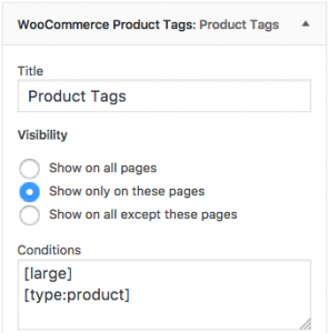
Example : Show a certain widget only on product pages and on large screens
Here we will use the following settings for the widget:
- Visibility:
Show only on these pages - Conditions:
[large]
[type:product]
This will show the Product Tags only on relevant product pages (shop, product tags, product categories, products) when viewed on a device with a large screen.
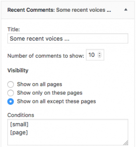
Example: Hide a widget on pages or if viewed on small devices
This example uses the following settings for a widget:
- Visibility:
Show on all except these pages
- Conditions:
[small]
[page]
With these settings, the widget will be displayed anywhere except when viewing the site on a small device or viewing a page.


